Connect & Heal: Simplifying and designing healthcare experiences

Connect & Heal: Simplifying and designing healthcare experiences

Connect & Heal: Simplifying and designing healthcare experiences

ABOUT
ABOUT

What is Connect & heal ?

What is Connect & heal ?

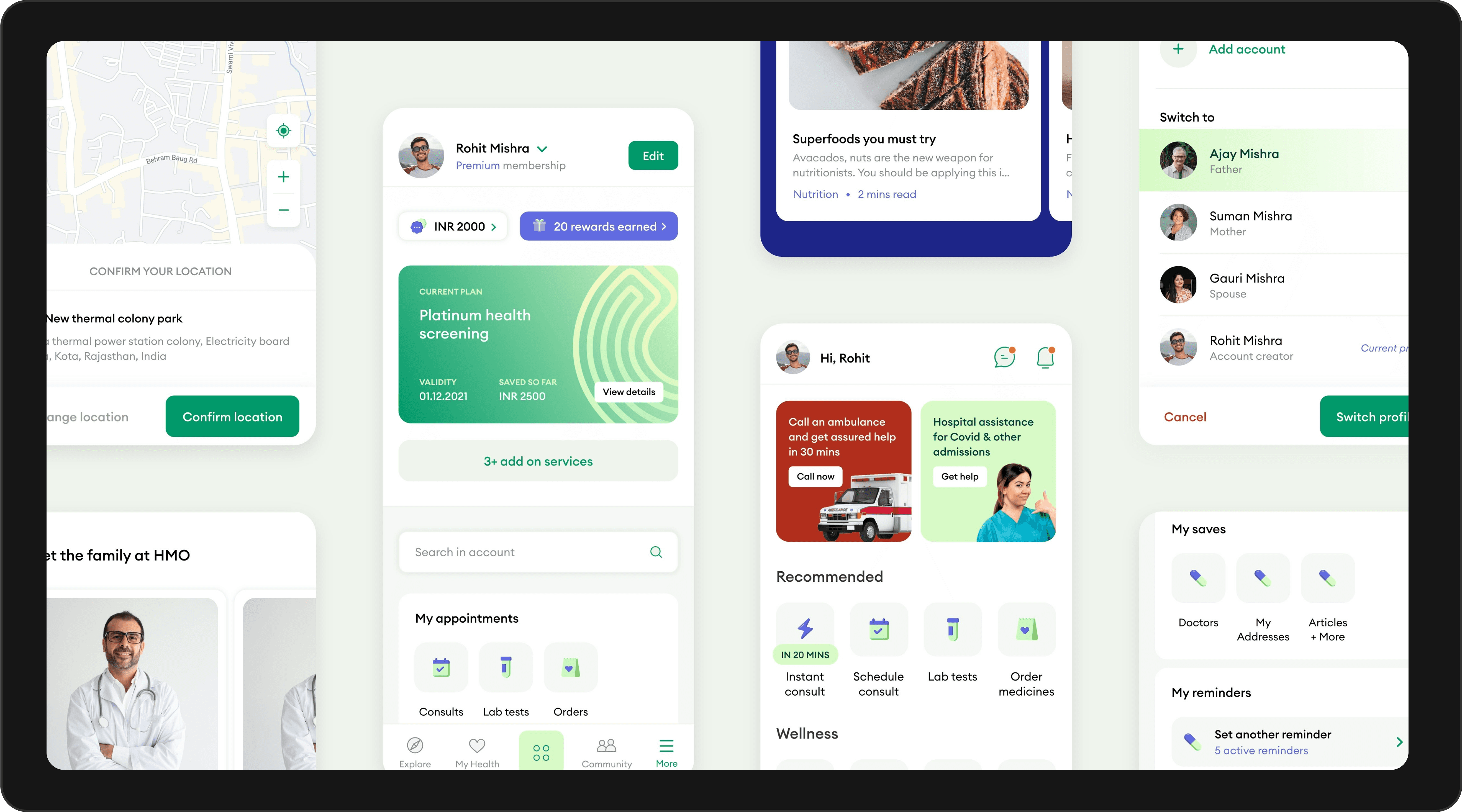
  • Connect and Heal is an integrated health tech company providing end-to-end  coordi-nated care and health coverage. 

  • They provide 360-degree care with an in-house team of 250+ multidisciplinary doctors comprised of specialist clinics, ambulances, hospitals, pharmacies, and diagnostic centres across  60 + cities.

TARGET AUDIENCE
TARGET AUDIENCE

Millennials

Millennials

  • 5-34 years old. These young adults are starting their careers and family lives. They care about their health but not preventative healthcare.

Gen X

Gen X

  • 35-50 years old. These individuals are well into their careers. They are family-oriented. Proactively preventing ailments becomes a high priority for them.

Baby Boomers

Baby Boomers

  • 51-60 years old. This persona will retire soon. They want to relax and enjoy their lives. The health of their spouse and themselves is paramount.

RESEARCH & PAIN OINTS

Context

  • Post-pandemic, telemedicine usage in India surged from 21% to 44%. Despite this growth, users still hesitated to adopt it as a primary healthcare option.

Challenge

  • Design a scalable B2C digital healthcare product that makes telemedicine accessible, engaging, and a part of users’ daily routines—transitioning the company from a B2B to B2C model.

RESEARCH & PAIN OINTS

Context

  • Difficulty navigating key sections.

  • Lack of intuitive interaction and poor discoverability of features.

  • The old design lacked a cohesive narrative, making it difficult for users to follow a clear journey or understand the platform's value proposition.

  • The current layout feels static and visually unappealing.

  • Inconsistent branding and lack of modern aesthetic.

  • High bounce rates and low engagement with CTAs.

Challenge

  • Difficulty navigating key sections.

  • Lack of intuitive interaction and poor discoverability of features.

  • The old design lacked a cohesive narrative, making it difficult for users to follow a clear journey or understand the platform's value proposition.

  • The current layout feels static and visually unappealing.

  • Inconsistent branding and lack of modern aesthetic.

  • High bounce rates and low engagement with CTAs.

RESEARCH & PAIN OINTS

Context

  • Post-pandemic, telemedicine usage in India surged from 21% to 44%. Despite this growth, users still hesitated to adopt it as a primary healthcare option.

Challenge

  • Design a scalable B2C digital healthcare product that makes telemedicine accessible, engaging, and a part of users’ daily routines—transitioning the company from a B2B to B2C model.

CHALLENGE
CHALLENGE

Problem statement

Problem statement

  • Conduct in-depth UX research to shape credible, engaging features

  • Refresh and scale the brand identity alongside the product

  • Drive user adoption and long-term engagement with digital healthcare

PROPOSED SOLUTIONS
PROPOSED SOLUTIONS

Virtual Waitroom Experience

Virtual Waitroom Experience

  • Designed a “preparation room” with a progress bar, health forms, and curated content to make wait time engaging.

  • Captured pre-consultation data early to streamline the doctor-patient interaction.

  • Difficulty navigating key sections.

  • Lack of intuitive interaction and poor discoverability of features.

  • The old design lacked a cohesive narrative, making it difficult for users to follow a clear journey or understand the platform's value proposition.

  • The current layout feels static and visually unappealing.

  • Inconsistent branding and lack of modern aesthetic.

  • High bounce rates and low engagement with CTAs.

Personalized Health Tracking

Personalized Health Tracking

  • Built a centralized hub for appointments, metrics, and insights.

  • Integrated gamification and rewards to boost consistent user engagement.

  • Difficulty navigating key sections.

  • Lack of intuitive interaction and poor discoverability of features.

  • The old design lacked a cohesive narrative, making it difficult for users to follow a clear journey or understand the platform's value proposition.

  • The current layout feels static and visually unappealing.

  • Inconsistent branding and lack of modern aesthetic.

  • High bounce rates and low engagement with CTAs.

Awareness & Recommendation Frameworks

Awareness & Recommendation Frameworks

  • Used bold visual cards and contextual pop-ups to highlight health actions, driving better recall and engagement.

  • Introduced nudges for appointments, medicine reminders, and wellness tips.

  • Difficulty navigating key sections.

  • Lack of intuitive interaction and poor discoverability of features.

  • The old design lacked a cohesive narrative, making it difficult for users to follow a clear journey or understand the platform's value proposition.

  • The current layout feels static and visually unappealing.

  • Inconsistent branding and lack of modern aesthetic.

  • High bounce rates and low engagement with CTAs.

Community-Driven Motivation

Community-Driven Motivation

  • Enabled community discovery and health event participation via swappable cards.

  • Curated peer-driven content based on user history to support habit formation.

  • Difficulty navigating key sections.

  • Lack of intuitive interaction and poor discoverability of features.

  • The old design lacked a cohesive narrative, making it difficult for users to follow a clear journey or understand the platform's value proposition.

  • The current layout feels static and visually unappealing.

  • Inconsistent branding and lack of modern aesthetic.

  • High bounce rates and low engagement with CTAs.

WEBSITE INSIGHTS
WEBSITE INSIGHTS

Explore My Design

Solutions

Explore My Design

Solutions

Explore My Design

Solutions

IMPACT
IMPACT

Quantitative improvements

Quantitative improvements

  • Improved user satisfaction scores by 25%.

Bounce Rate: Reduced by 12%.

Qualitative improvements

Qualitative improvements

  • Market leaders. 360-degree care coordinators. Proactive. Digital-first healthcare specialists. Community-oriented.

CHALLENGES AND LEARNING

Challenge faced

Challenge faced

  • The pandemic changed the world forever, with telemedicine doubling from 21% to 44% of respondents!

  • This caused a shift in India’s digital healthcare sector, but users still didn’t see telemedicine as an alternative.

Learnings

Learnings

  • We created personas, formed a hypothesis, ran user research with stakeholders, and shaped the product strategy from insights.